WILLIAM EGGLESTON |
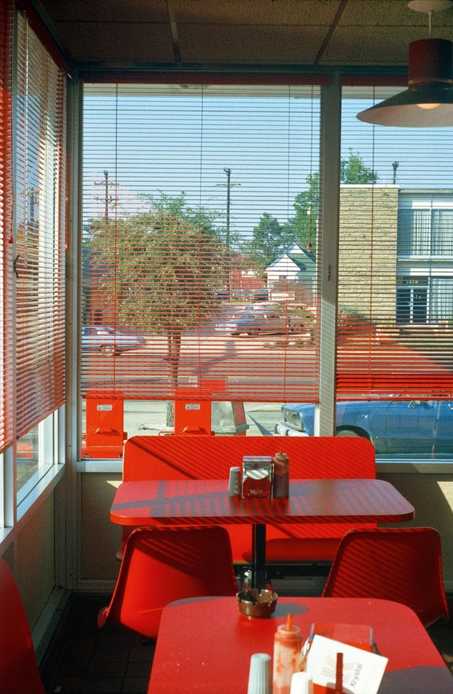
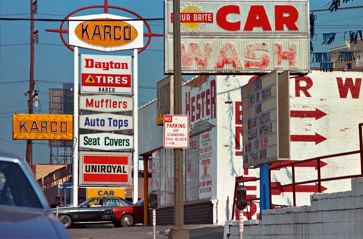
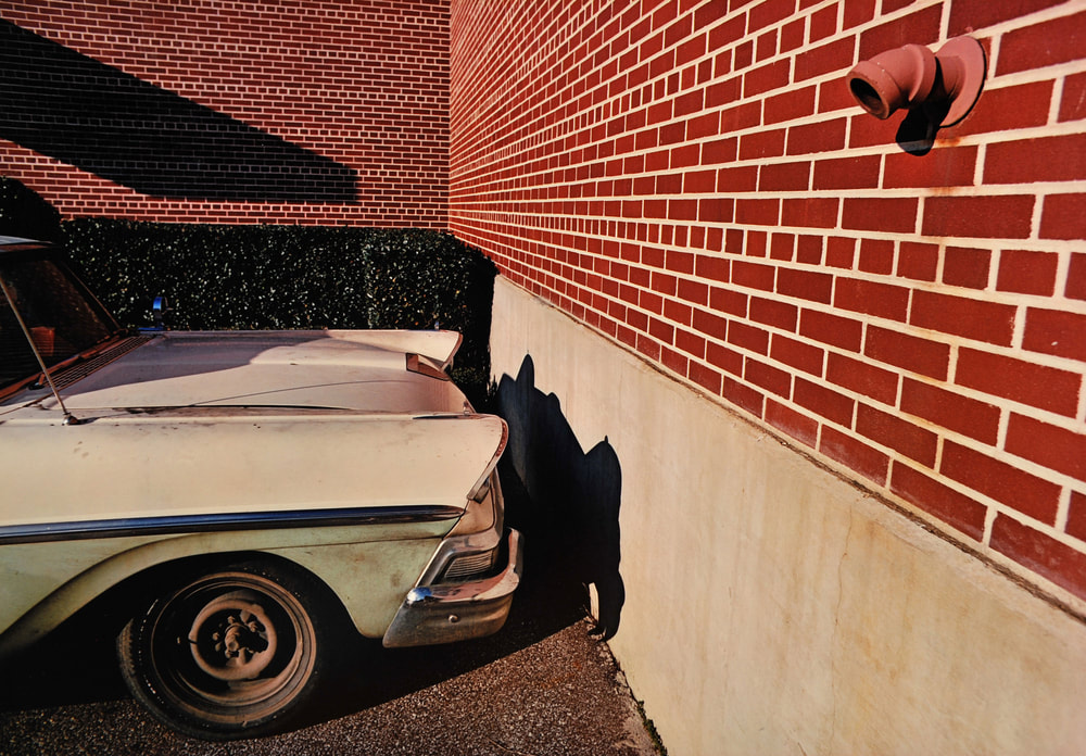
William Eggleston used colour photography as a way to describe cultural transformation of Tennessee. His photos include everyday life which include portraits of family and friends, gas stations, cars and shop interiors. He switched from black and white to colour and now that is what interests me, the colour in his work and the shadows and how intense they are and thats all you can focus on. His work is based in America and the diners and the different colours and shadows he sees there. Eggleston's work main focuses as seen below are shadows and colour. He is known mostly for widening the use of colour photography and making it more recognisable.
|
|
|
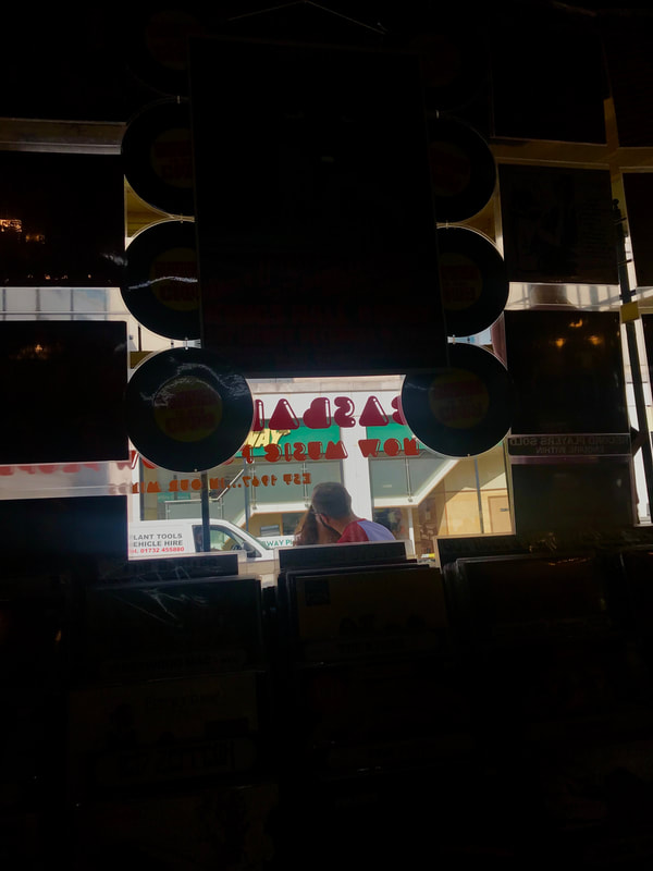
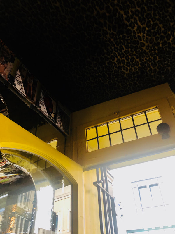
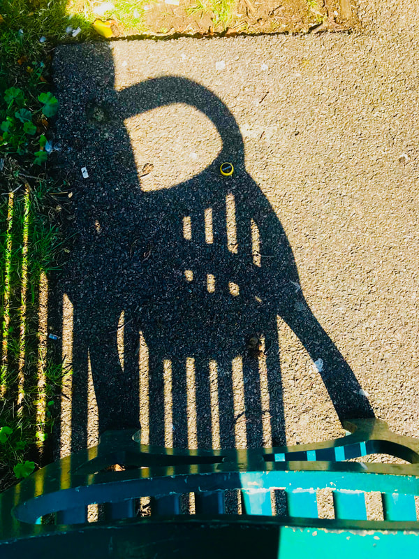
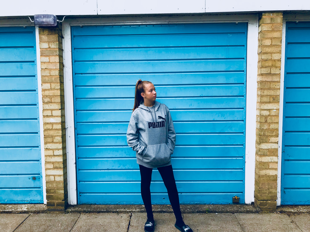
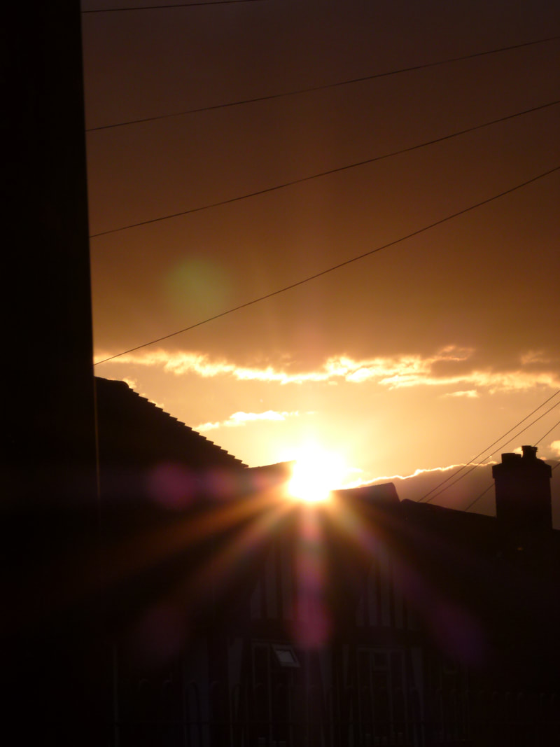
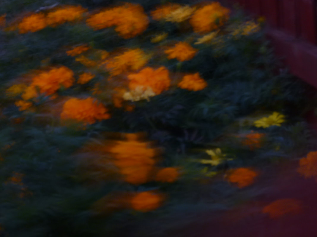
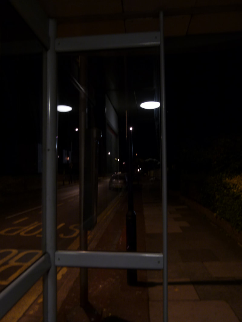
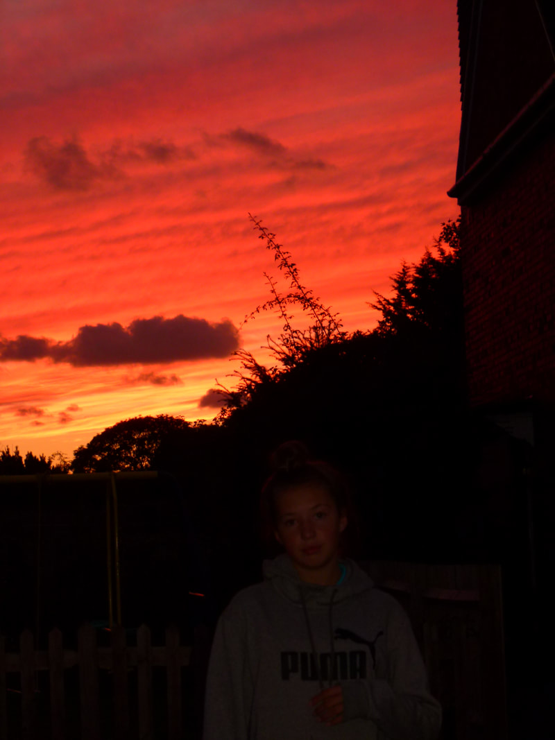
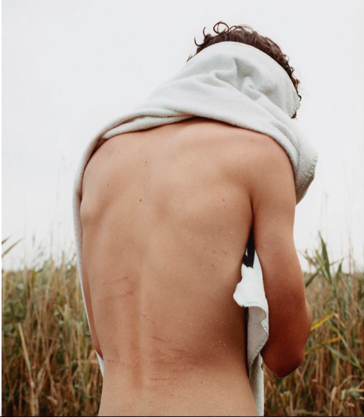
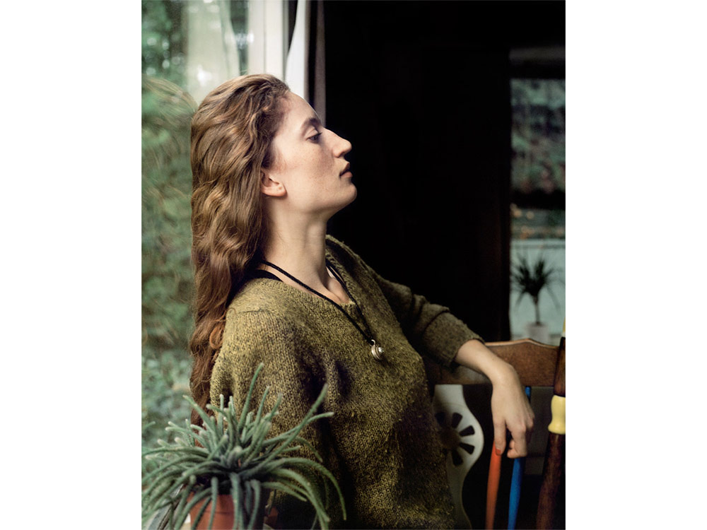
These are some of my responses from my take on William Eggleston's images. My main focus was shadow and colour which is what most of these images include. Some of these images are very vibrant and include a main focus in them, each of them show a different thing and focus on a different sub topic, even though they are all inspired by the same artist. I enhanced the colour and shadows a bit just so you could cleary point them out, in the before images you can see them and are able to spot them but they have just been enhanced so you can really see what I was focusing on.
Roland Barthes- Camera Lucida
The main two factors in a photographic image are studium and punctum. Barthes calls stadium 'a kind of discovery of the operator' Stadium being the element that creates element interest in a photograph. Culture is an important connotation within studium, where as punctum is an object or image that jumps out at a viewer within a photograph.
Dolores Marat
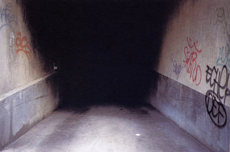
Dolores Marats photographs all focus on a subject but then you are drawn to the darkness each image has to them. The darkness that is in all of these images is quite unsettling and and in a way disturbing as we don't know what the darkness entails, what does it mean, why has she chosen to focus on the darkness but also have a subject matter that does stand out in this images also. I am immediately drawn to the darkness and shadows that are featured in these images, then my focus goes to the colours surrounding and the subject that is also in the photograph. Marat's images are taken with and without flash but ideally all still focus on the darkness wether it be harsh or soft.
|
The first image I focused on of Marat's is the one which looks as if its an alleyway of some sort, this image doesn't allow us to see what is down the alleyway or what is in front of us, It allows us to see the sides of the images and the graffiti on the walls. The darkness is another key part and again is mysterious, this is isn't really and outline like the second image, it is more just a big section, it doesn't make anything in the image a silhouette and very much leaves us guessing about what is going on or where this is.
|
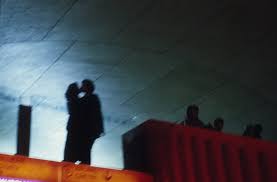
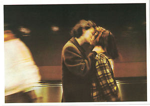
Each images connotes a different topic, however there are two images or a couple kissing. We cannot see who they are in the first images as they are blacked out and you can only see shadows where as the second one we can see but can only assume who they are because they are facing sidewards meaning only half of their faces are visible to us. Even then we cannot really see their faces as they are slightly blurred. This is what draws me to these images as we don't know who they are and the blur adds effects to the image as its as if the background is blurred so we focus on them but then we can't even really focus on them as they are also slightly blurred meaning the whole image is slightly a mystery and is very mysterious. However, in the image before we see a couple, we don't know if this is the same couple or a different one and we are not sure who they are but we just have to assume who they are as the image doesn't allow us to see who they are. This images looks as if it has been taken is that the photographer is below them and they are higher up and I don't think this was staged, I think she was just passing by and managed to capture this moment but was in a darker area so the couple have been blurred out. The first thing I focus on I this image is also the couple and I begin to wonder who they are and why the photography chose to capture this particular and if she meant for them to be in complete darkness.
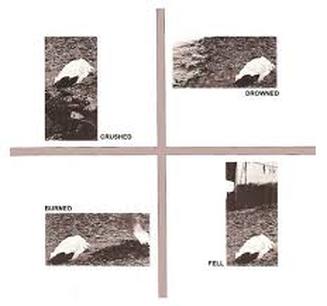
John Hilliard's 'Cause Of Death'
|
John Hilliard used 4 different photographs of a dead body that all have text placed next to them to show how a single word can change the way we look at things and they way we see an image and how a word can change the way we may look at it at first and then once a word is placed next to it we change the way we see it. He has placed the words 'burned', 'fell' ,'drowned' and 'crushed' next to each image. The viewer is influenced by the word Hilliard has placed next to it. By Hilliard putting a word next to the image we see the image as what the word says. We think that something different has happened to each image when in fact the image is in the same location and the person that is there has died from one cause and just by changing positioning of how u take the image changes the way we see it. By changing the positioning of the camera this shows the 4 ways the person could have died ,all in the same location just with a different word next to it and a different position which looks as if the body has been moved. I have also done an example of this where i have taken an image and cropped it so it looks like 4 different images. My images focus on shadows and silhouettes. This example is just one original image being cropped, focusing on different things in that one image and how they can look like different images but be one.
|
John Myers. The world is not beautiful.
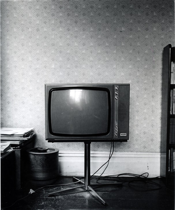
This image John Myers has taken at first did not interest me at all, I'm still not sure how interested I am with it now but I have realised a lot more about this photograph than when I first saw it after I had discussed the elements of the image. I noticed if you split this image into 3 sections you noticed how there is hardly anything in the top section, a little more in the second section and a lot more in the bottom. In the 3 section it is very cluttered and full where as in the top section it is more empty and theres nothing to look at apart from the wallpaper patterns. The bottom section is cluttered and there is more to look at. the tones are darker, theres more of a subject and a lot more detail. For example, if you look in the tv you can see how the picture is being taken and you can see the camera but not the photography ,this is a question i am asking, where is the photographer? He could have done this on purpose and took the picture so you only see the camera in the reflection and not him and may have used a timer. This is one of many questions I would ask, why did he position the camera so you can see the camera in the reflection but not him?. Before really looking at this image I didn't know what to think of it or what even to say about it but once I had taken a proper look and thought about it a bit more I started to understand it. This image normally wouldn't appeal to me, I'm still not sure if it does or how much it does. |
|
|
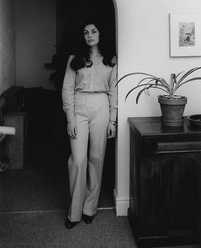
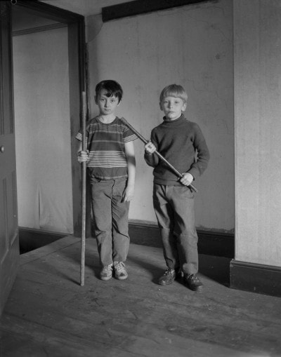
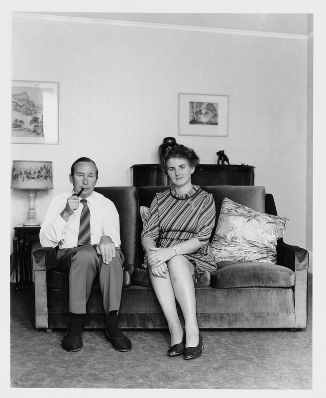
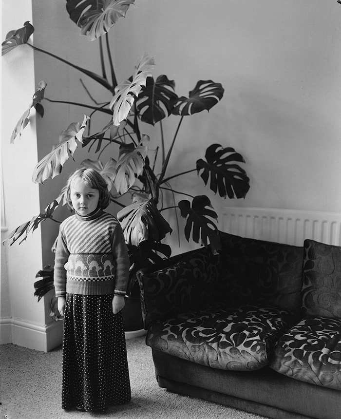
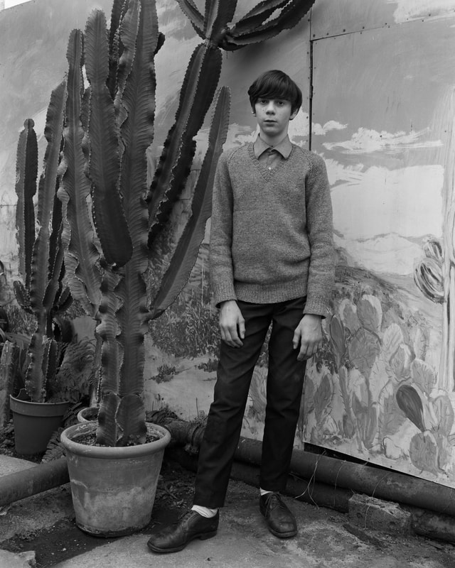
The John Myers images are more of the style of photograph that I would want to take, portraits are more the style I would take rather than the first image I would look at. This images look as if they are still life images and look very set up, they don't look like the environment is natural and looks more like they have been made to stand there and pose rather than catching them in the moment. I like both these styles of image, more natural images capture the more realness of the images where as the set up, still life images show the way the photograph wants them to turn out and places everything in a way he/she wants to and makes it more likely to turn out that way. But images taken in the moment are more of chance and the chance of them turning out the way you want which in a way is more exciting because they could either be nothing you wanted or everything you wanted them to be so this element of chance is better than setting it up because you get to play around more.
|
|
Tereza Cervenova
Keith Arnatt |
Tereza Cervenova is one of the many artists we looked at whilst in Brighton, her work 'June' was the one we focused on in Brighton which she then came and spoke to us about in class.
|
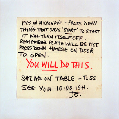
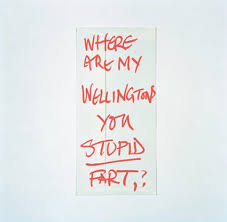
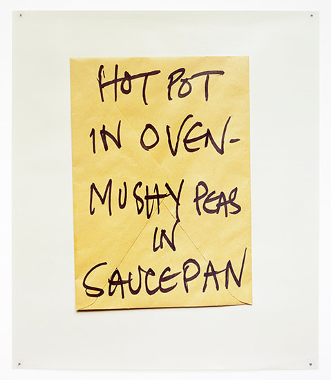
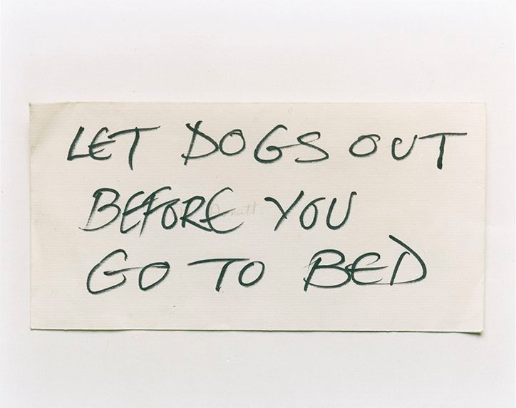
Keith Arnatt in this images photographed notes his wife had left him, mostly instructions and things he needs to complete but some were insults she had left him. My final pieces really relate to this and I felt I got very inspired from the work because I wasn't creating anything and seeing this work made me realise if I just starting writing down all my thoughts and feelings I would start to create a body of work. I looked at this work and started to create work that was similar, but instead my feelings about photography were written down.
|
|